Brand & Website Design for Hallcourt Farm
COMPLETE BRAND AND WEBSITE DESIGN PROJECT
Beth and Francis run Hallcourt Farm, a family farm set across 60 acres of garden, fields and woodland in Midgham, West Berkshire. Alongside the grazing sheep and cattle, the farm had quietly grown into something more: an oak-framed barn for weddings and celebrations, much-loved seasonal days out and, most recently, a pilates studio and wild sauna amongst the wildflowers. Guests adored the place, but the brand wasn’t matching the wholesome yet whimsical charm of the farm. With so many different offerings, Hallcourt Farm needed an identity that could hold every part of it together and tell the story visitors already felt, without tipping into something commercial.
-
The strategy grew out of conversations with Beth and Francis and was shaped in the Creative Direction, where we distilled what Hallcourt Farm truly stands for: the beauty of small things, authenticity over ambition, moments worth making, a sense of mischief and a place with a future. Looking across the local landscape, rural venues all tended to reach for the same shorthand, the wide-angle barn shot, the barn logo and websites that look polished but tell no story. Hallcourt Farm's strength was the opposite. Rather than competing with grander estates, the brand would feel real and unhurried, with a gentle streak of heritage and whimsy, a place guests choose precisely because it is small, family-run and full of character.
-
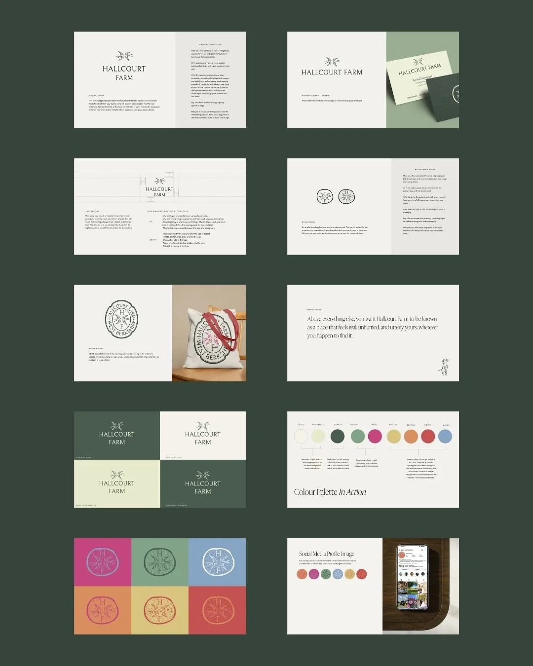
Every part of Hallcourt Farm's brand identity was built to reflect the farm's story, from the colour palette through to the logos and all the little details in between that tie it together. The challenge was to create a brand that would work across very different events and ages, and speak to the values and history of the farm, without ever feeling commercial or generic.
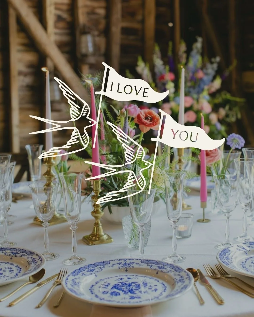
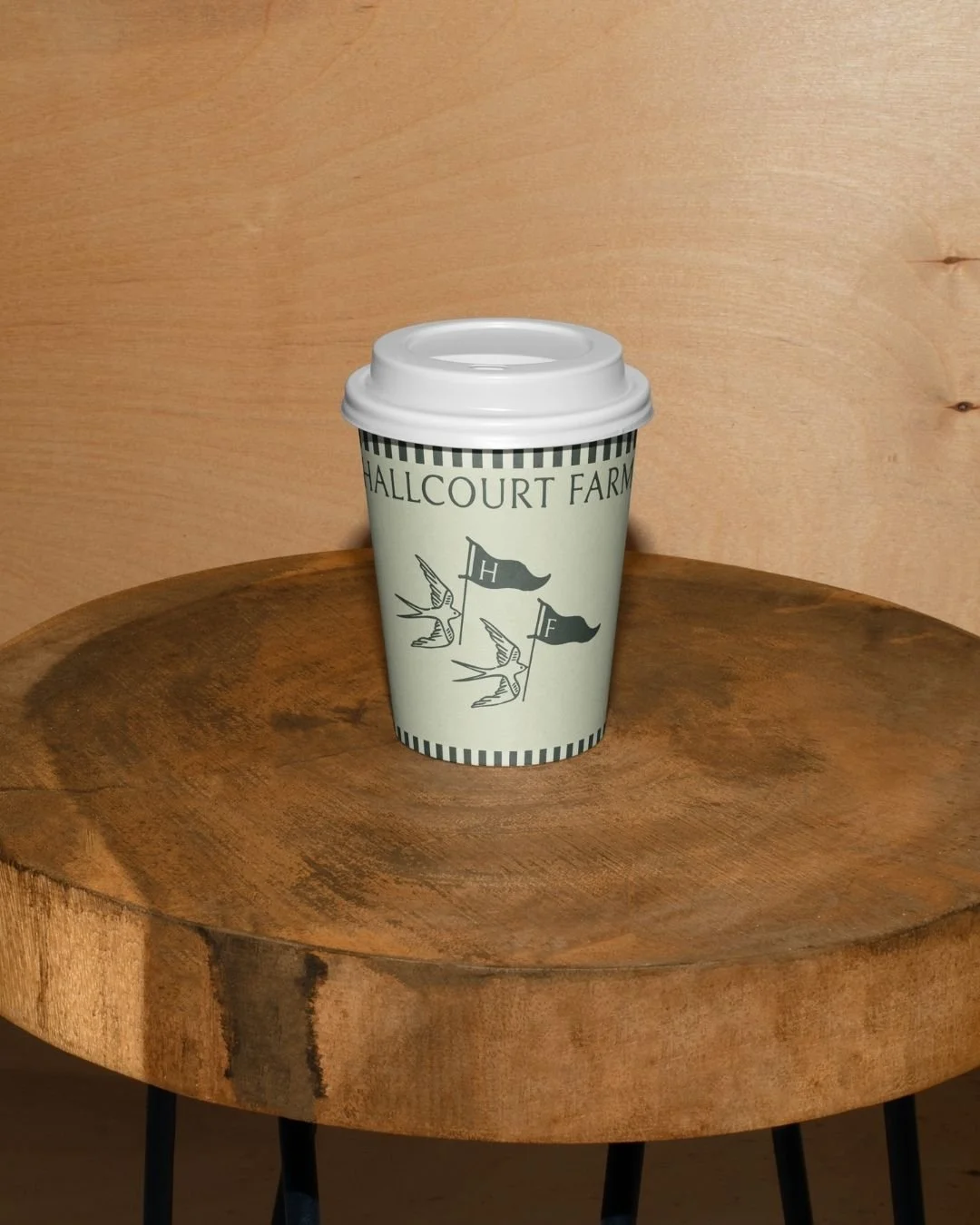
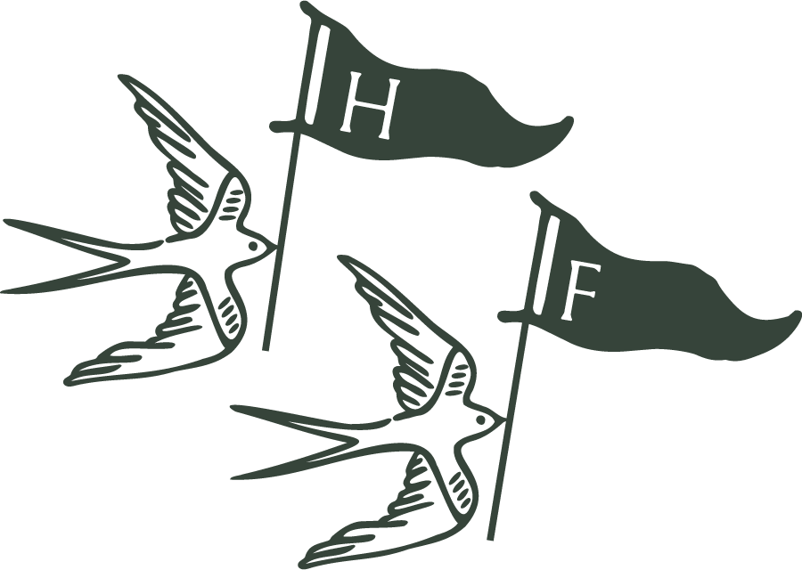
After a brand identity deep dive, the swallows became the pivotal, playful piece of the jigsaw that helped everything else come together. Swallows nest in the barn and return to it year after year, a fitting symbol for a family farm built to last and for the guests who keep coming back. Each bird began life as a hand drawing, which was then vectorised and refined on screen, and became the foundation for all the logo variations.
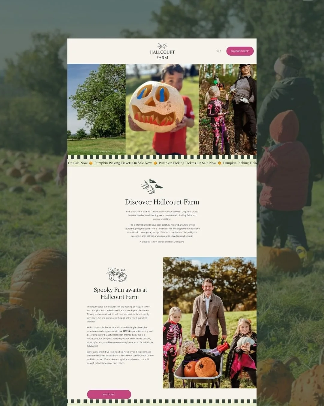
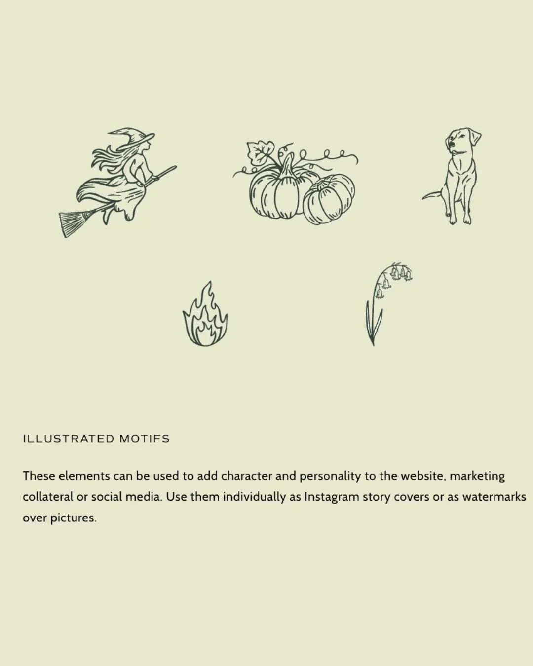
The logo typography was created bespoke, giving the brand a unique, characterful feel that still feels elevated. Hand-drawn illustrations bring personality to each part of the business, leaning into the farm's whimsical side, while a striped line adds definition and a touch of playfulness to the website sections.
The core colours were drawn from the farm and the land around it, a deep green and a soft Annabelle hydrangea green grounded by a light cream that lets the photography on the website speak for itself. Brighter accents were introduced for seasonal moments and social media, playing a supportive role that adds character without ever overpowering.
-
The strategy began with being clear on Hallcourt Farm's positioning: what the farm stands for and how Beth and Francis wanted it to be seen, alongside who their guests are and why they feel such a connection to the place. From there, the priority was protecting the special, wholesome feel that makes Hallcourt what it is. A handcrafted logo and illustrations, perfectly imperfect, give the brand an artisan, heritage feel that could never be mistaken for something commercial.
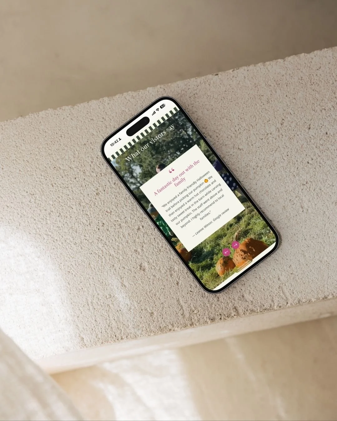
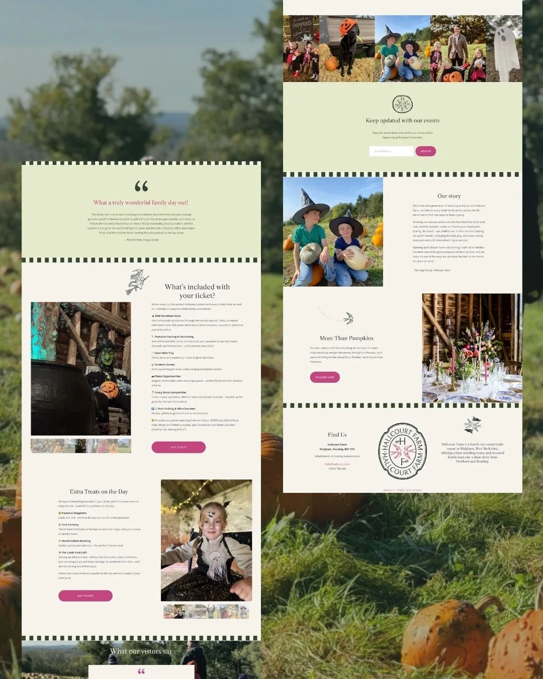
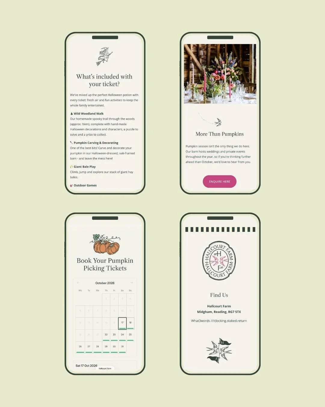
With families, couples, teams and wellness guests all finding their way to the farm, growth was built in from the start. Rather than a single fixed mark, the identity works as a flexible system, ready to welcome a café, workshops and whatever comes next without starting from scratch. The website gives each offering its own space, with the seasonal favourites, Pumpkin Picking and Blossoms & Bygones, each given a dedicated page and simple online booking. Navigation was kept clear and intuitive so the photography and illustrations could showcase the magic of Hallcourt at every turn, while considered SEO and FAQs help the farm show up and be found by a much wider audience through Google and AI search tools.
-
The new brand and website bring Hallcourt Farm's story to the forefront, so visitors connect with the people and the place before they have even set foot on the farm. Every touchpoint, from event flyers and signage to the newsletter and seasonal launches, now speaks with one warm, characterful voice. Hallcourt no longer sits alongside other barn venues hoping to be noticed. It occupies its own distinctive space: a family farm with heart and a little mischief, where the welcome is personal and the memories are the kind people carry with them, and come back for year after year.
Despite the brand being recently launched the response to the new brand and website has been overwhelmingly positive with lots of new visitors to the site and an increase in ticket bookings for Halloween.
Cathrin totally got who we are, what we are about and who we are for - she just understood us. The brand identity she came up with is absolutely stunning. It makes me happy every time I see it! I loved working with Cathrin... she is calm, patient and takes time to get to know your business so she can build a brand and website that is 100% right. I couldn't imagine what was 'right' for our small family farm, until Cathrin put it right in front of me.