Crafting a Distinctive Brand for Sadgrove Farm
COMPLETE BRAND AND WEBSITE DESIGN PROJECT
Sadgrove Farm is a multi-faceted food business run by chef Matthew and his wife Miranda in West Berkshire. This unique venture encompasses bespoke catering experiences, a popular monthly supper club hosted in their converted barn, a larder shop filled with delicious meals and sides, and immersive mushroom foraging courses in their ancient woodlands. Sadgrove Farm's ethos centres on the belief that food is more than just sustenance—it's a journey of taste, sustainability, and meaningful connection to the land.
Despite offering these diverse and elevated experiences, Matthew and Miranda were struggling with a brand identity that failed to capture the sophistication of their offerings. Their existing website lacked structure and visual consistency, making it difficult for customers to navigate between different services. They needed a cohesive brand that could represent all aspects of their business whilst positioning them as providers of elevated, memorable experiences rather than just another farm shop or catering service.
-
My approach began with understanding what unified all of Sadgrove Farm's diverse offerings. Through visiting the farm and extensive conversations with Matthew and Miranda, I recognised that every aspect of their business was rooted in deep connection to their specific place and heritage. The old red brick buildings, weathered wooden barns overlooking rolling fields, and the sense of timeless agricultural tradition formed the backbone of their authentic story.
The strategy was to create a brand that felt both rooted in heritage and distinctly modern—sophisticated enough to justify premium pricing for their elevated experiences, yet approachable enough to welcome families to their foraging courses and supper club events.
-
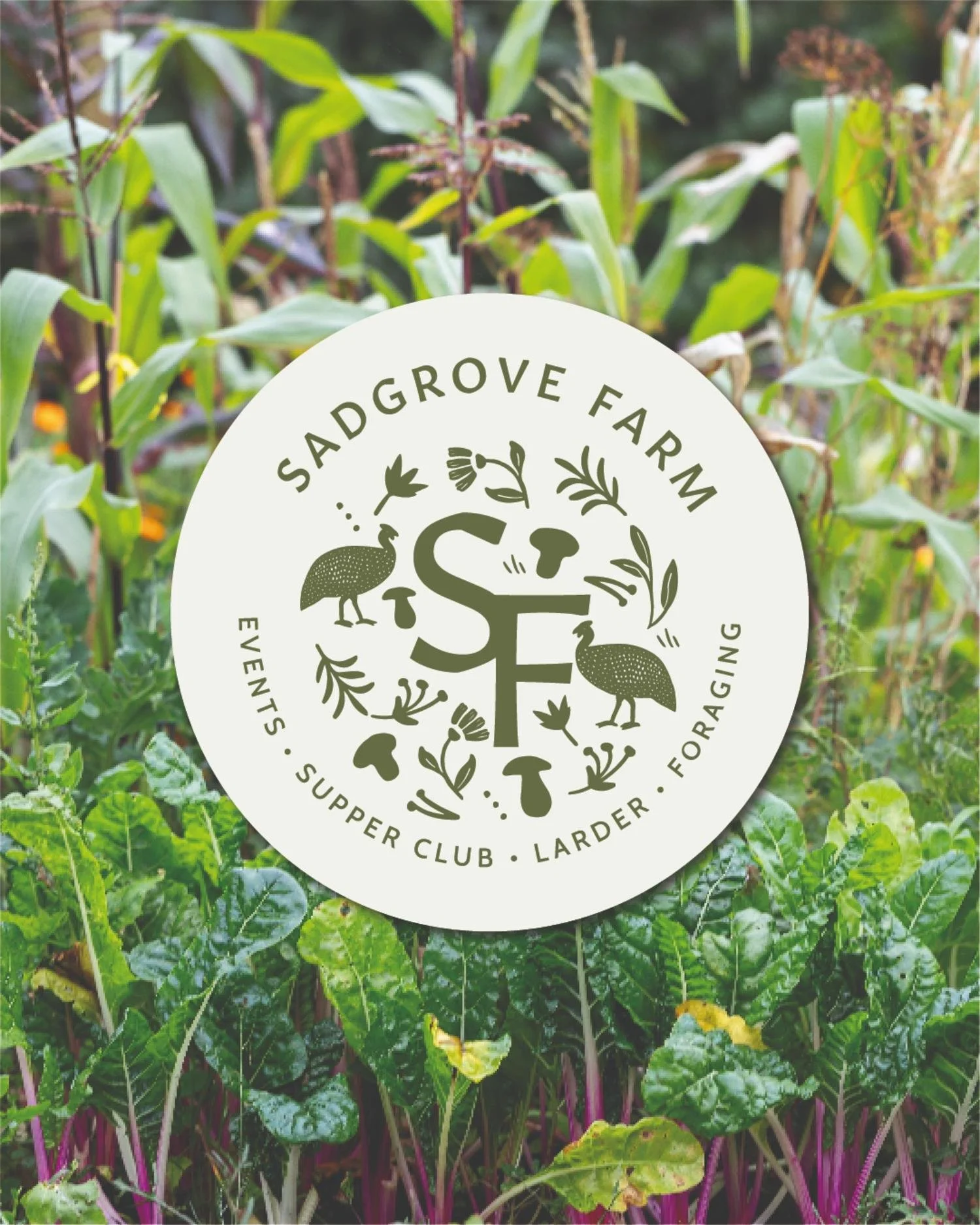
I wanted to create a distinctive brand that echoed the charm and character of the Sadgrove Farm setting whilst accommodating all aspects of the business. The logo needed flexibility to work across vastly different applications—from elegant catering proposals to rustic packaging for their larder shop.
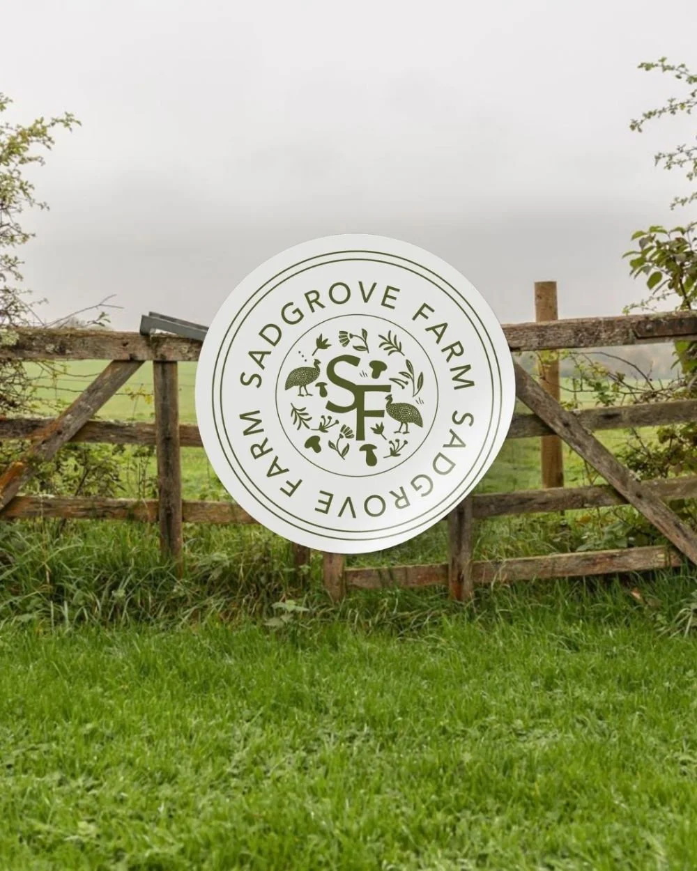
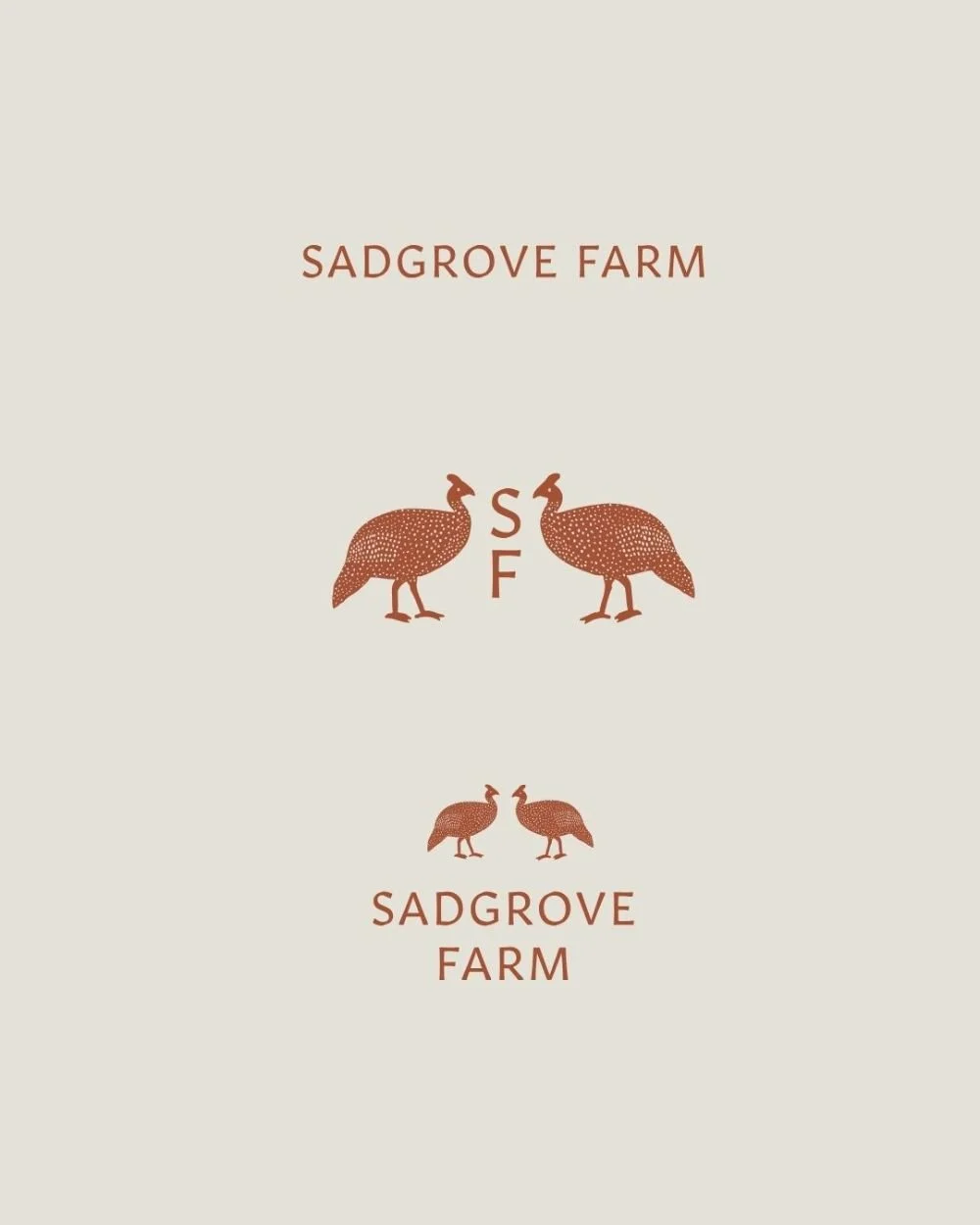
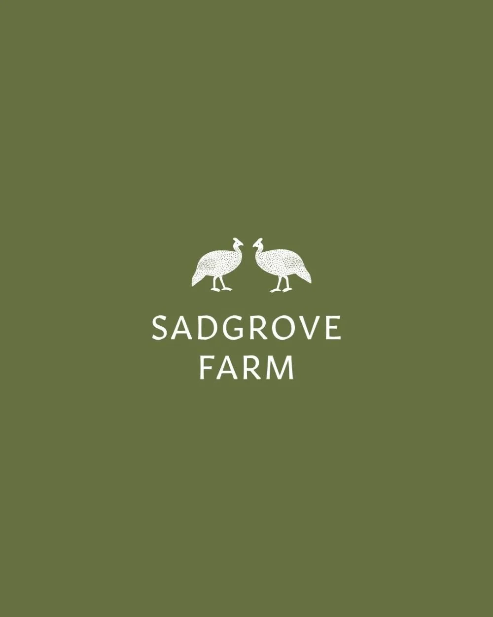
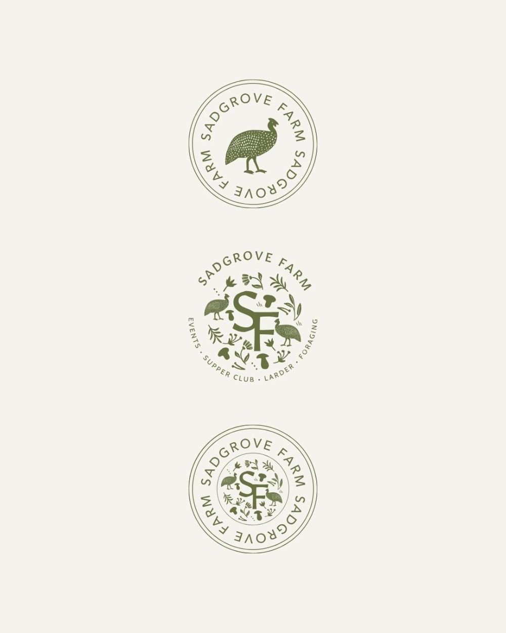
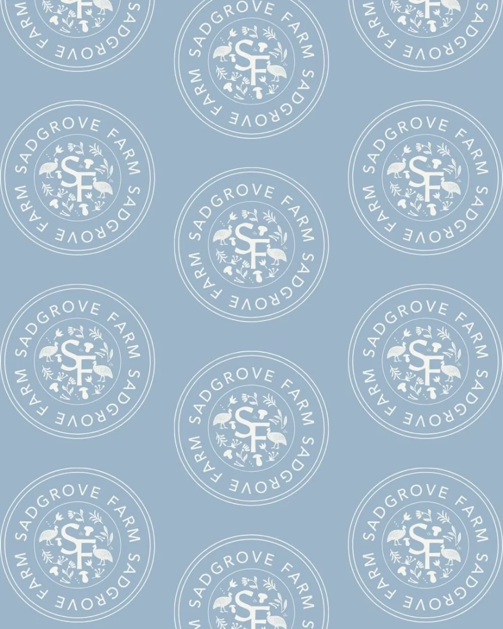
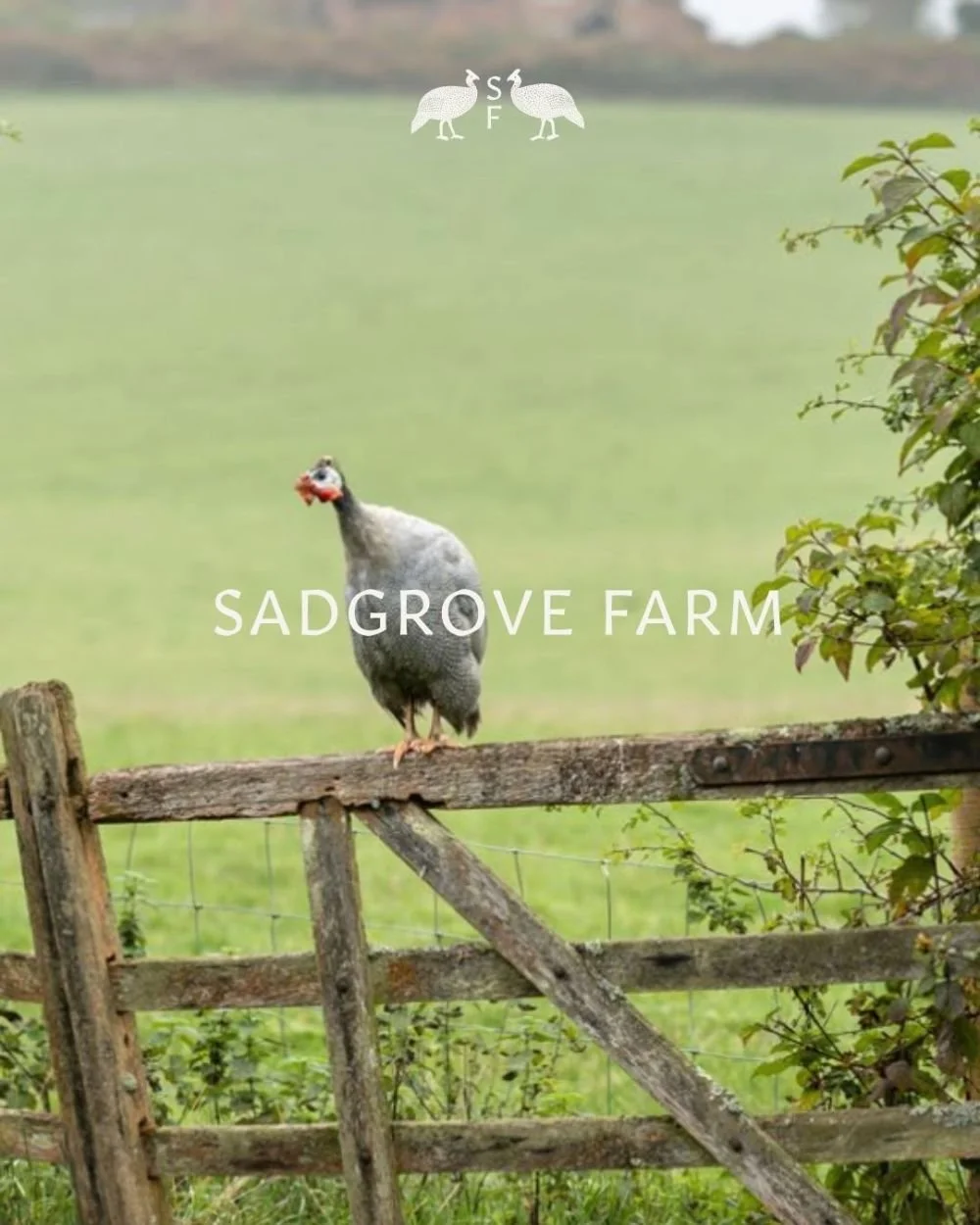
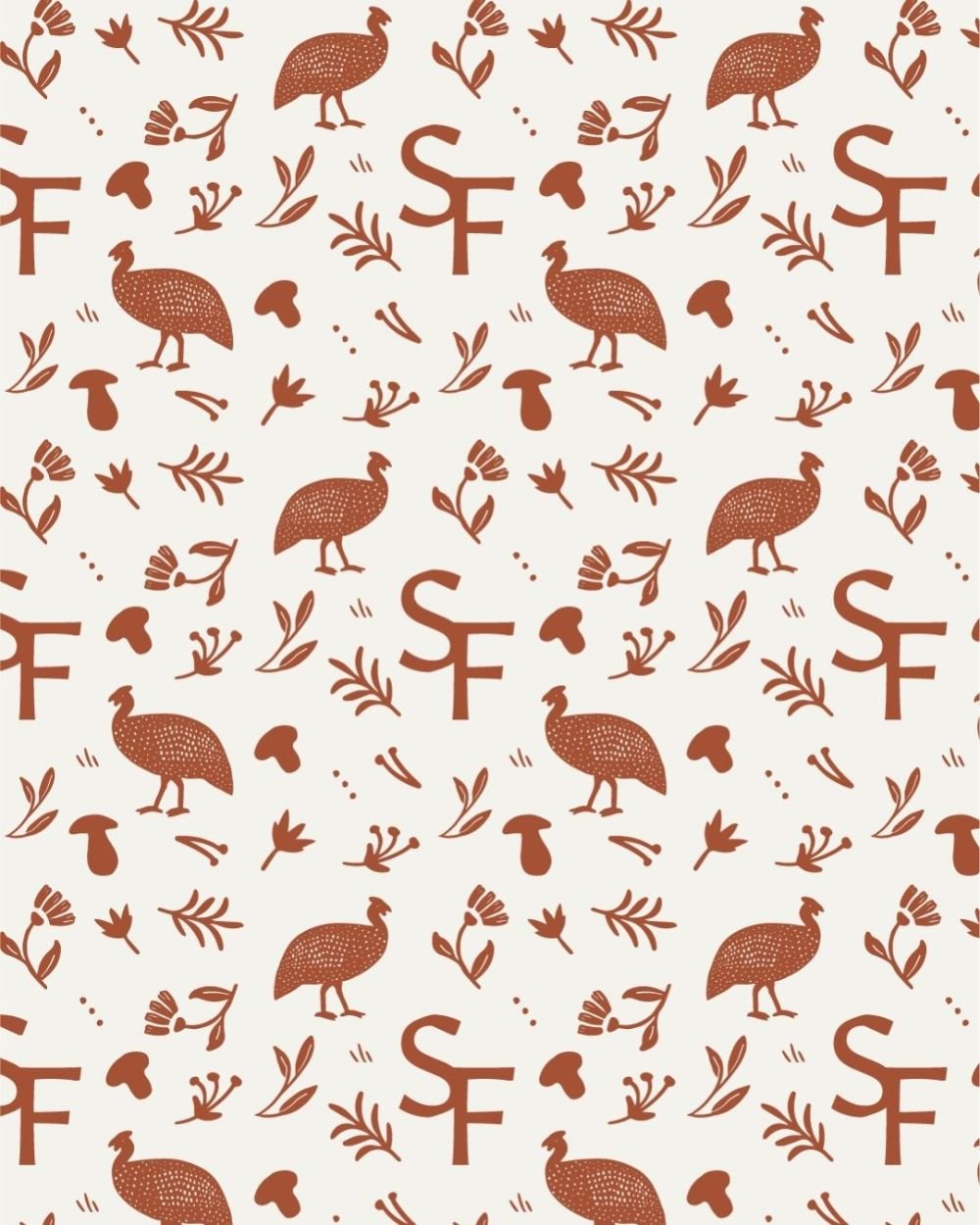
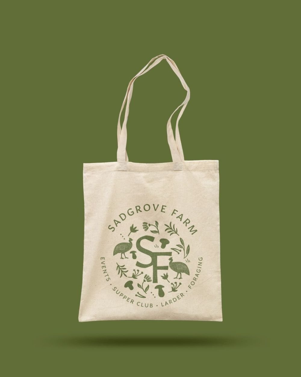
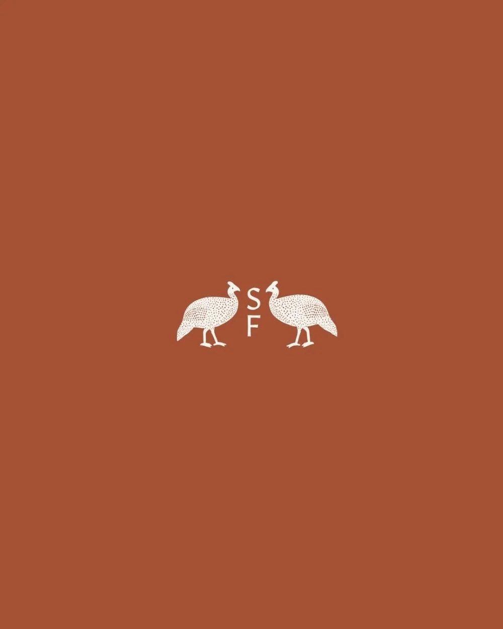
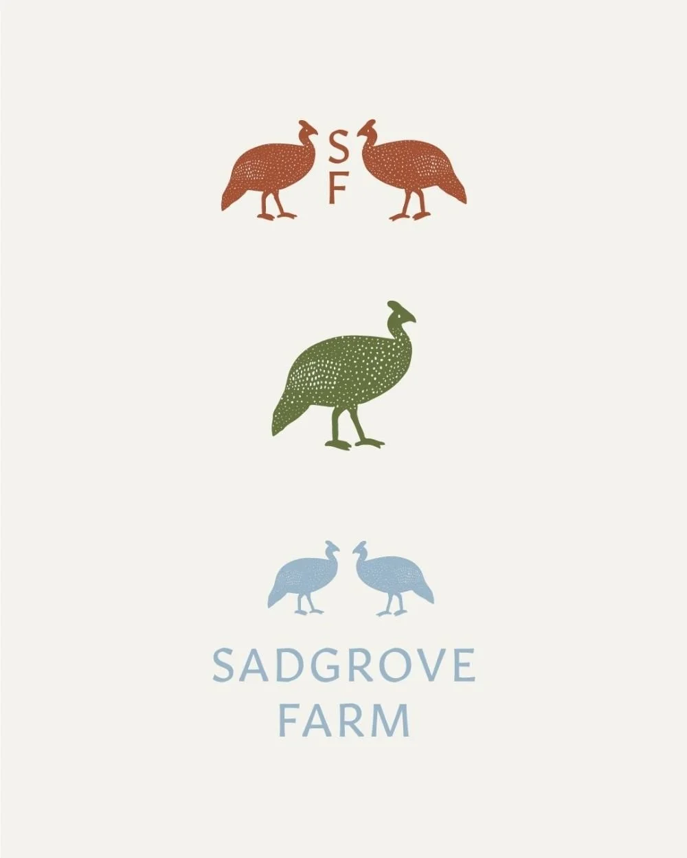
The solution was to develop a logo system containing several complementary elements, each representing different sectors of the business whilst maintaining visual cohesion. At the heart of the design were the guinea fowl that roam freely through Sadgrove Farm's gardens—these distinctive birds became the perfect symbol of the farm's character, being both charming and slightly unexpected, just like the business itself.
These guinea fowl illustrations weren't just decorative elements; they became a distinctive brand signature that immediately communicated the authentic, farm-based nature of the business whilst adding personality and memorability. The birds could be used individually or in groups, creating flexibility for different applications.
-
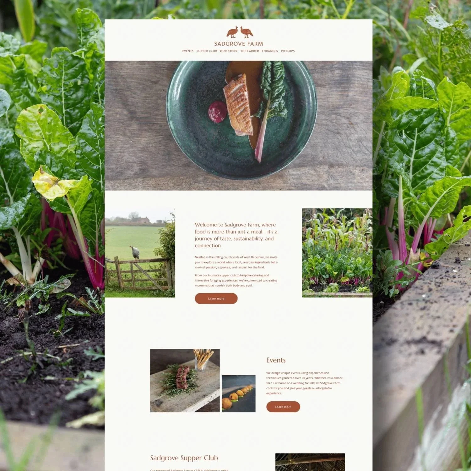
The main typeface was carefully selected for its authoritative yet approachable characteristics, creating a memorable feel across professional catering materials and casual social media posts. The font needed to feel both established and fresh—conveying the expertise and heritage of traditional farming whilst appearing contemporary enough for their modern, elevated approach.
The colour palette was developed to reflect the countryside setting whilst creating a distinctive look across their website, packaging, and social media. Rather than defaulting to predictable farm colours, I created a modern interpretation of countryside hues that felt fresh and sophisticated, maintaining the premium positioning they sought whilst creating instant brand recognition.
-
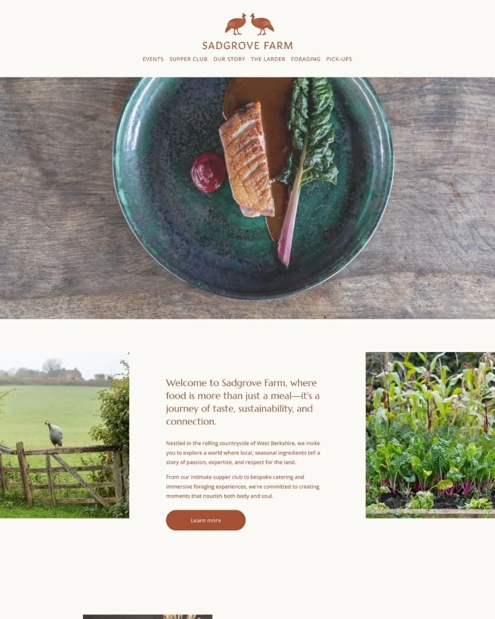
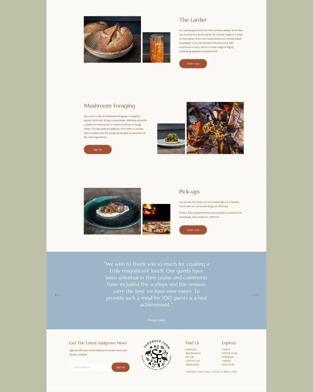
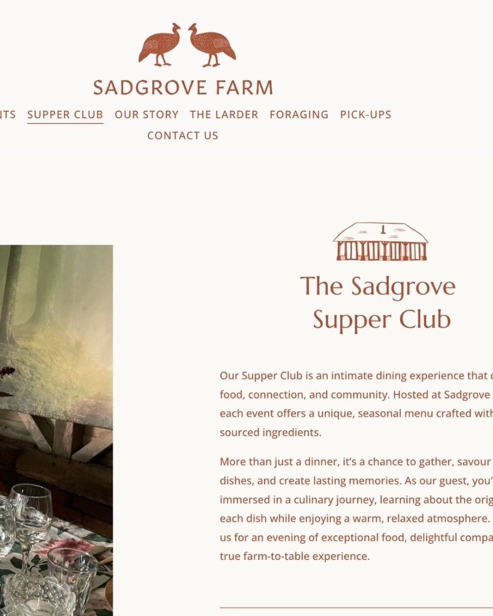
The brand system was implemented across a completely restructured website that prioritised clear navigation and user experience. Each aspect of their business—catering, supper club, larder shop, and foraging courses—was given its own clear pathway whilst maintaining visual consistency throughout. The brand extends seamlessly from digital applications to physical touchpoints, including packaging and marketing materials.
The rebrand has successfully positioned Sadgrove Farm as a premium destination for elevated food experiences. The cohesive brand identity has made it easier for customers to understand and navigate their diverse offerings, whilst the distinctive visual identity has helped them stand out in the competitive food and hospitality market. Matthew and Miranda now have a brand that truly reflects the unique character of their business and supports their continued growth.