Modern brand design for luxury rental house, Cotters Stay.
BRAND DESIGN DAY
Ben and Victoria owned a beautiful holiday cottage with luxury interiors and rich heritage, but they had no existing branding to communicate their property's unique character. They were competing in a crowded market of local holiday rentals, many of which looked similar in their marketing approach. Their goal was to create an elevated brand design that would help them stand apart from other properties in the area, attract a more discerning clientele, and justify premium pricing. They wanted to position their cottage not just as accommodation, but as a special destination where guests could truly escape and unwind.
-
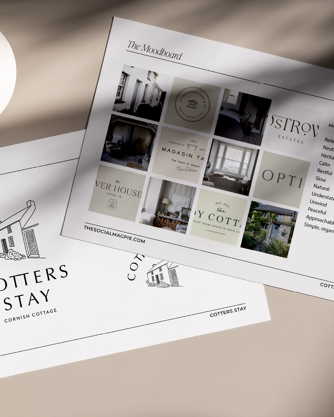
I began by deeply exploring what made this cottage special. The property's most striking features were its original architectural elements – the beautiful wood beams and aged floors that spoke to its heritage – paired with Ben and Victoria's carefully curated soft furnishings and thoughtfully chosen heritage-inspired finishes. This combination created a unique modern heritage aesthetic that felt both sophisticated and welcoming.
My approach was to translate these tangible, physical qualities into a visual identity that would immediately communicate the cottage's character to potential guests. I wanted the branding to feel like a natural extension of the space itself, creating consistency between the marketing materials and the actual guest experience.
-
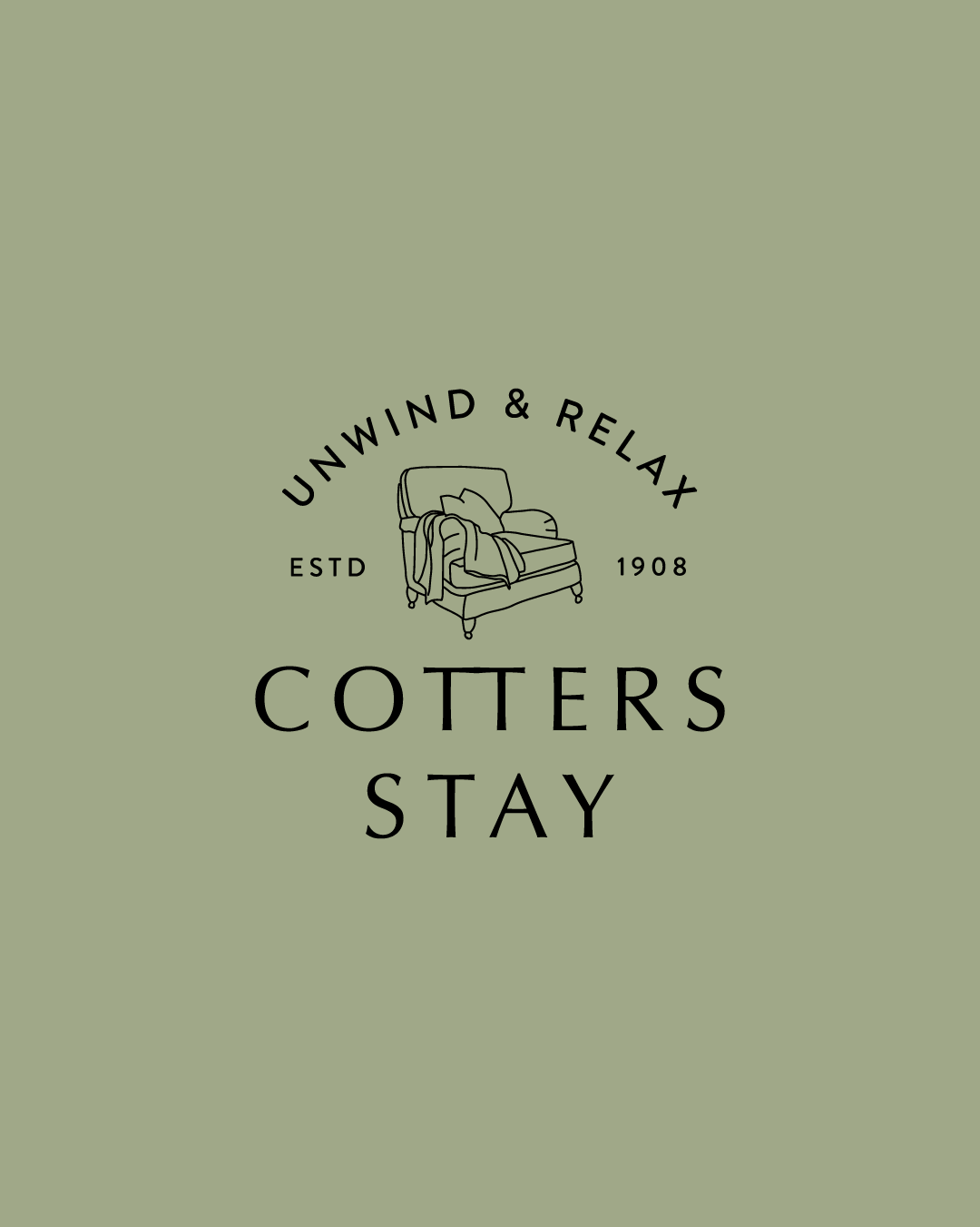
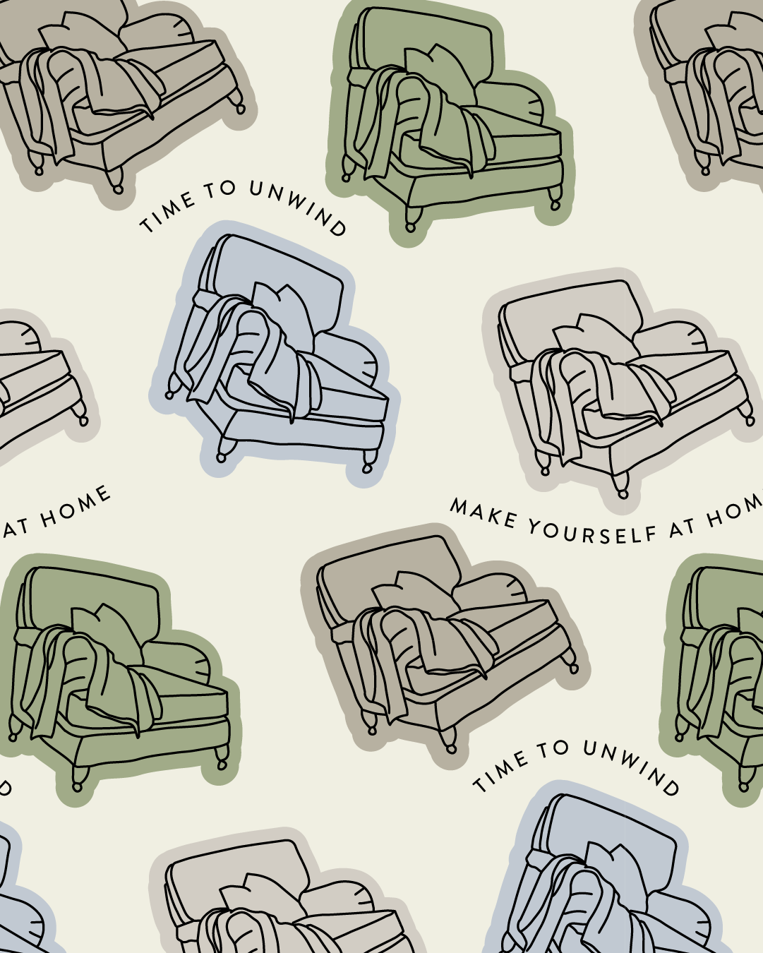
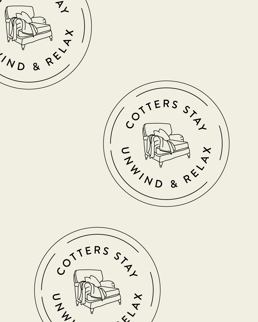
The typography selection was crucial in establishing the refined yet approachable tone. I chose typefaces that balanced elegance with warmth, ensuring they felt both premium and homely. The hand-drawn illustrations became a signature element of the brand, adding personality and craftsmanship that you simply can't achieve with stock imagery or generic icons.
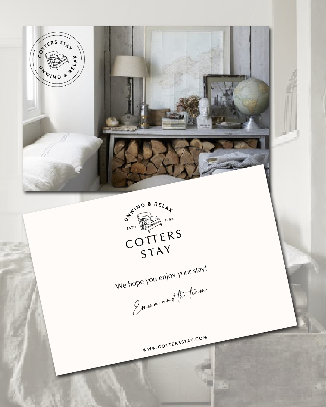
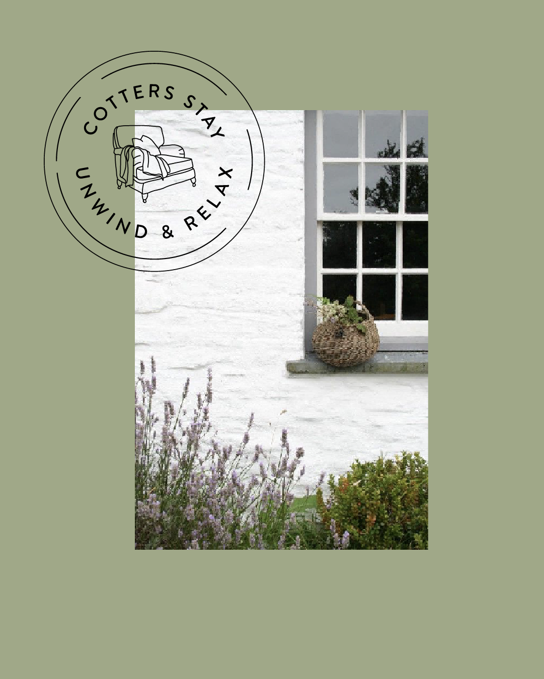
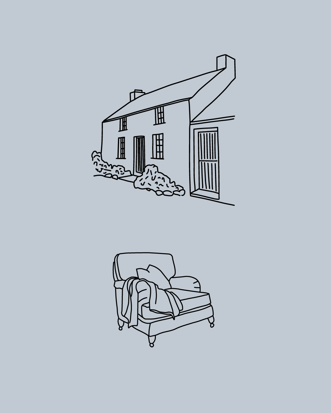
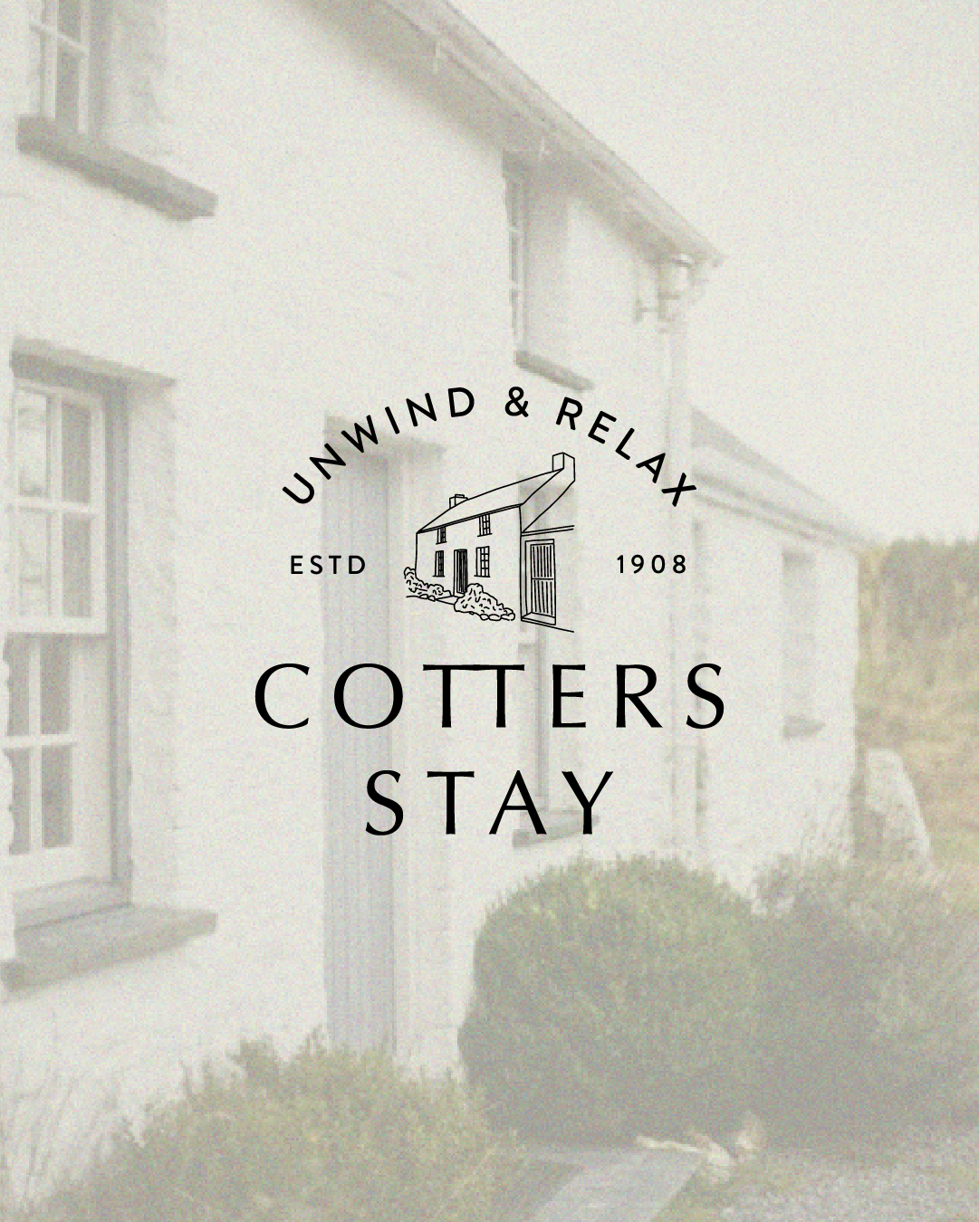
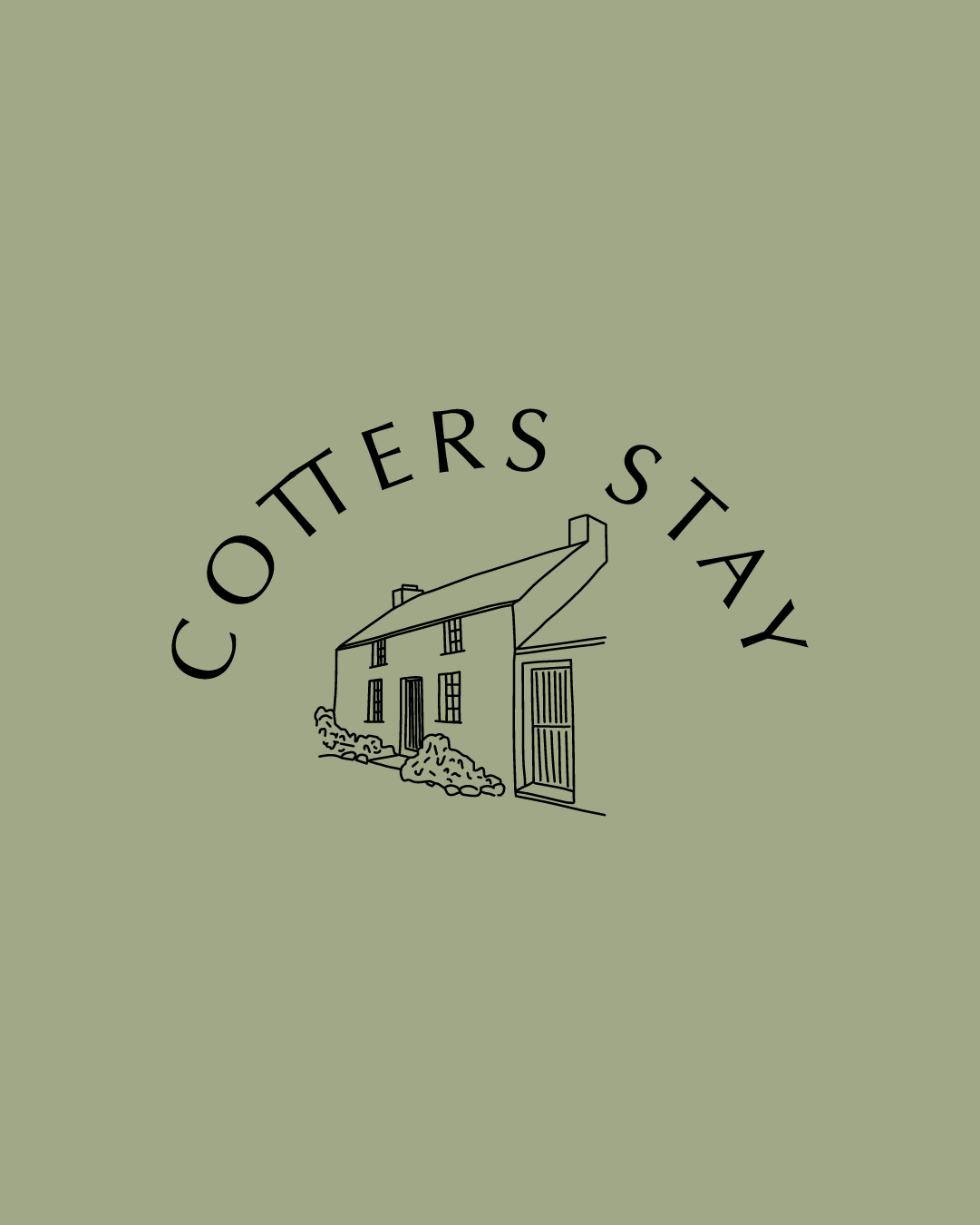
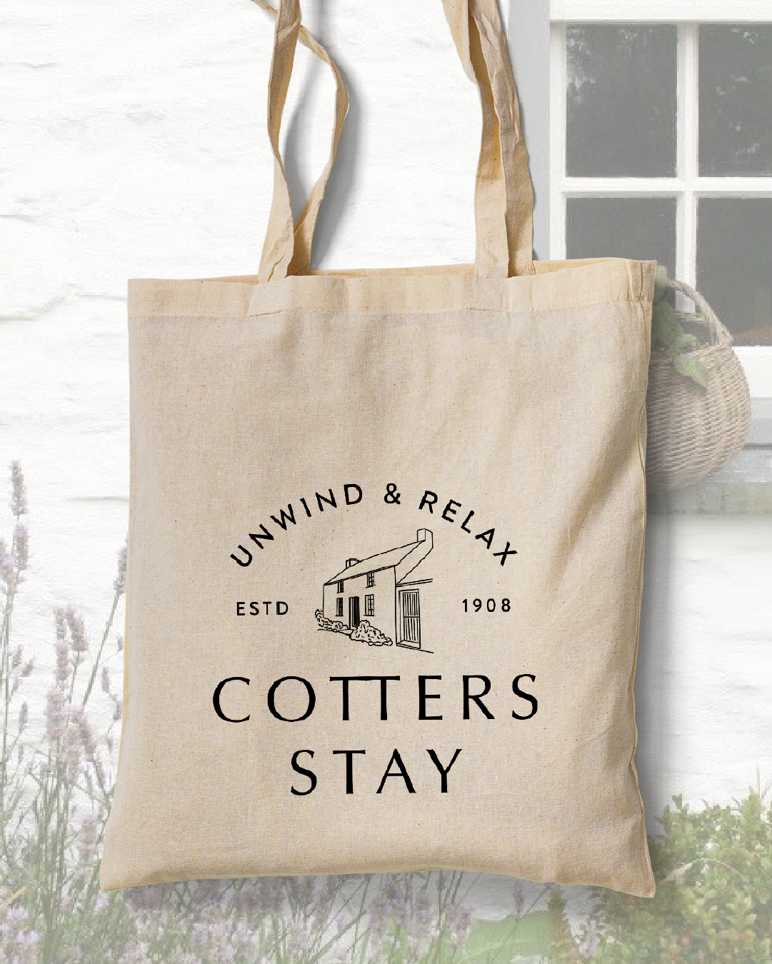
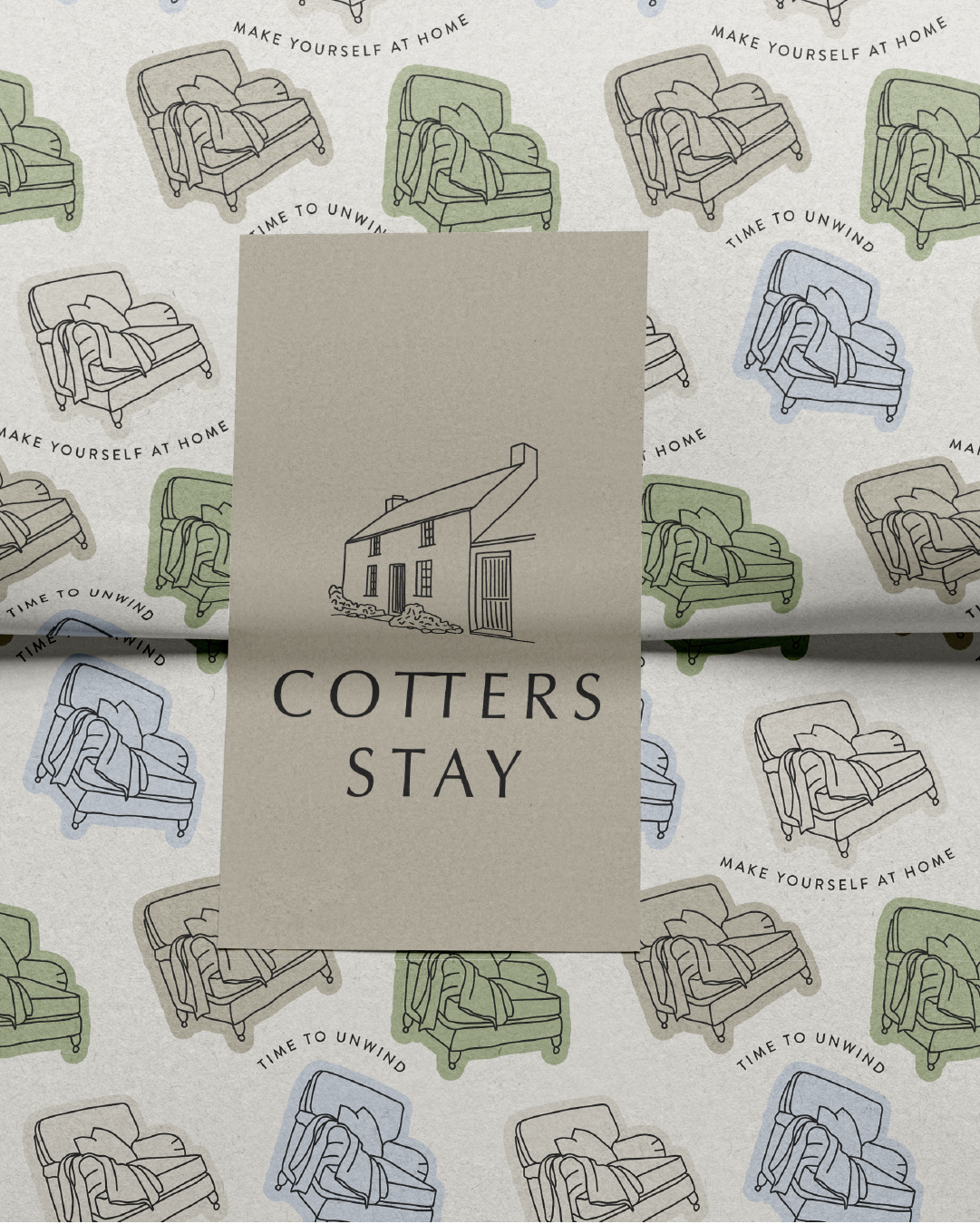
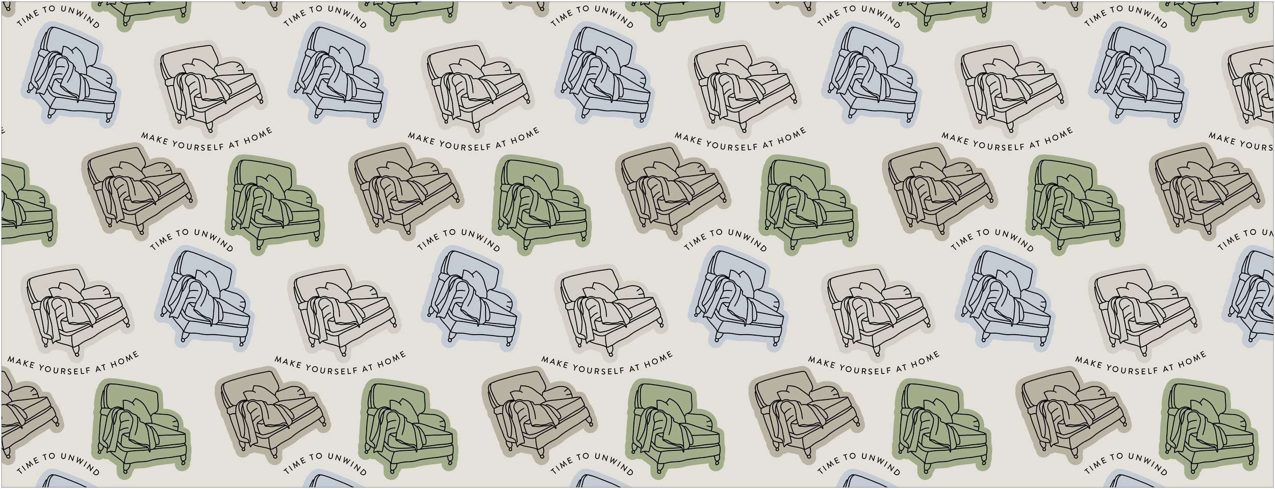
As part of the design process, I considered physical elements that would immediately signal to potential visitors the kind of cozy, relaxing experience they could expect. A custom illustration of a striped armchair with a throw became the perfect secondary icon – it's both specific to the cottage's aesthetic and universally recognizable as a symbol of comfort and relaxation. The cottage's unique architectural silhouette was transformed into the primary logo, creating a memorable and distinctive brand mark that guests would instantly associate with their experience.
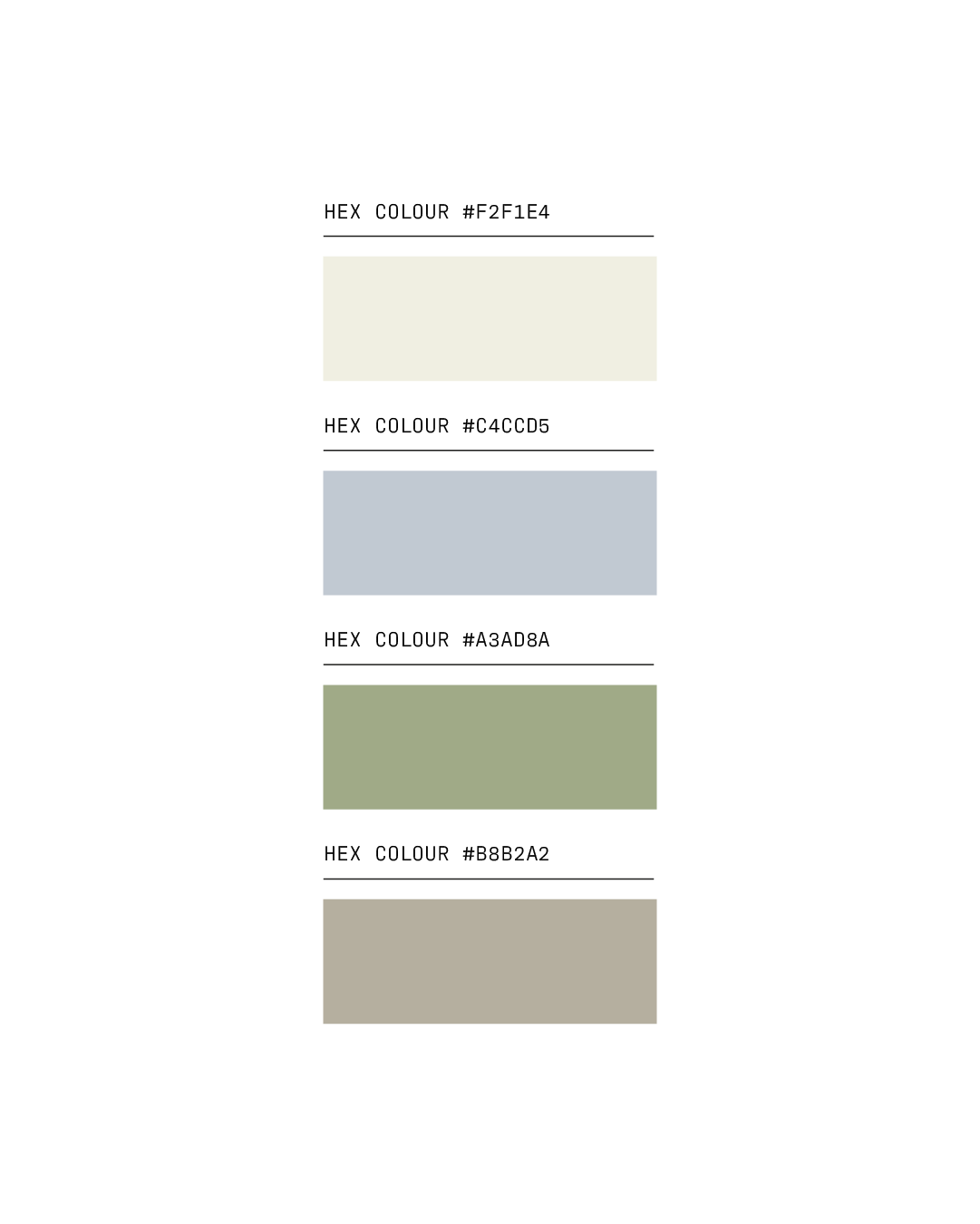
The color palette was carefully developed around the organic elements surrounding the cottage, drawing inspiration from the coastal setting and natural environment. These soft, welcoming hues were chosen not just for their visual appeal, but for their psychological impact – creating an immediate sense of calm and restfulness that aligned perfectly with the cottage's positioning as a place to unwind.
-
The cohesive visual identity was applied across all customer touchpoints, including their website, business cards, marketing postcards, and social media presence. Each application maintained the brand's core personality while being optimized for its specific purpose and audience.
-
The rebrand has delivered significant business results for Ben and Victoria. They've seen a notable increase in bookings and enquiries, and the elevated brand positioning has allowed them to successfully raise their prices. Perhaps most importantly, they've experienced a surge in repeat visitors and word-of-mouth recommendations, with customers specifically praising the "wonderfully relaxing setting, beautiful interiors and stunning environment" – validation that the brand successfully communicates the experience guests can expect and delivers on that promise.